Sep 8, 2022
The Power of Color Theory
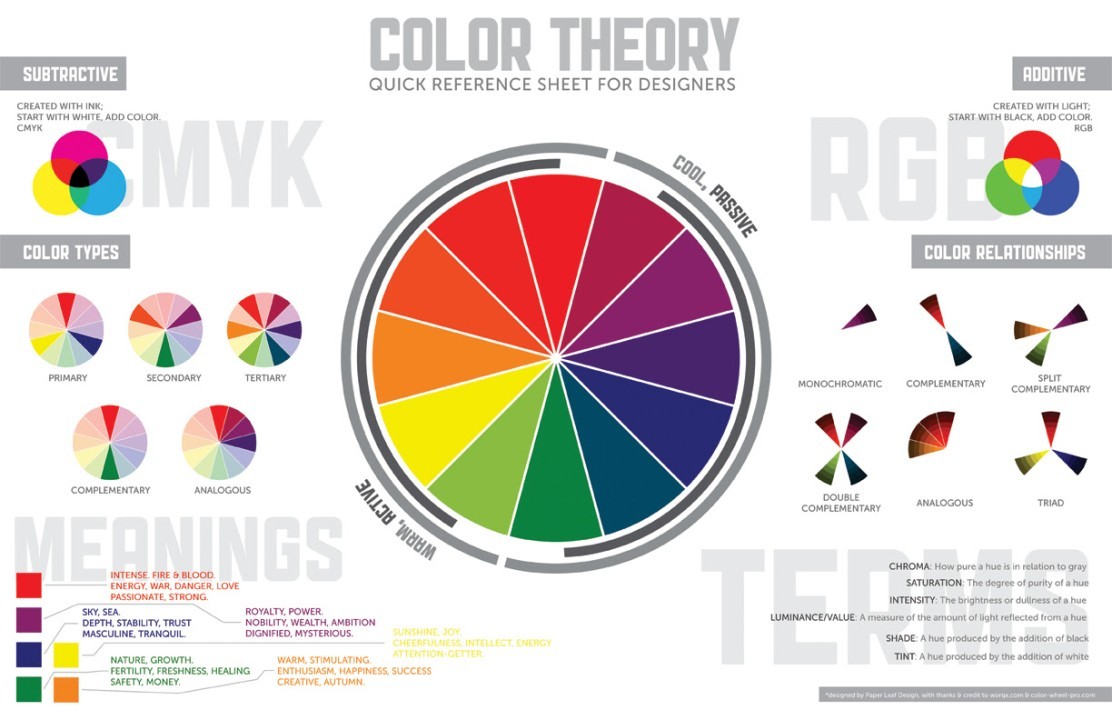
What is Color Theory?
Color theory explains the use of color to create an image. Different brands use different color schemes to represent their brands. Some brands use the blue color, which is often associated with dependability and trust. Others use multi-colored logos to represent diversity. To get a better understanding of color theory, you can look up some examples online. For instance, Dropbox uses a minimalist monochromatic color scheme.
Color harmony
One of the most important aspects of color theory is color harmony. The aim of color harmony is to create a visual effect that will captivate the viewer's attention. Using harmonious color combinations is a must when designing UIs. It will engage the viewer and establish an orderly flow. In contrast, unbalanced color combinations can make an interface look cluttered and boring.
Color harmony can be created by balancing warm and cool colors. Warm colors are calming and cool colors are energizing and intense. When planning a color scheme, think about how each color makes you feel.
Secondary colors
In color theory, secondary colors are created by combining equal amounts of two primary colors. For example, red and yellow combine to form orange. Likewise, red and blue combine to form green and purple. However, the final hue will vary based on the ratios of the primary colors. For example, mixing one part red with one part blue will create a lighter shade of purple while mixing two parts red and one part blue will create a darker shade of purple.
Secondary colors can create a unique look and feel. They are best used in contrast to primary colors because they can add a distinctive touch to a piece of art. They are also useful for creating unique color schemes and patterns.
Intensity
The third characteristic of color is intensity, which is a measure of strength or weakness. Bright colors have high intensity while dull ones have low intensity. Intensity is a measure of how light reflects off a particular color. For example, vivid red is clearly distinguished from dull maroon. However, dusty pink is harder to distinguish than a clear, fresh pink.
Understanding the intensity of color is an essential part of color practice, but it can be a tricky subject to master. This is because pigments rarely behave the way you'd expect them to. For instance, we rarely see super-intense colors.
Value
In art and design, the value of a color is an important aspect of composition. The value of a color is the relative lightness or darkness of that color. It plays an important role in the creation of spatial illusions and defines the form and quality of an object. The human eye is drawn to the contrast of light against dark colors. The value of a color also affects the color choice of a painting or design.
Color perception is based on perceptual, contextual, and temporal factors. Moreover, the way we perceive colors is influenced by cultural norms. Nevertheless, the basic principles of color theory can help you make effective color choices for your business. Whether you're working on a logo, website design, or marketing strategy, knowing how colors are perceived can help you create an effective image.